Tips & Hacks
Author:Anda Toshiki
Updated:a day ago
Words:1.2k
Reading:7 min
1: Responsive KaTeX Styling
1.1: Issue background
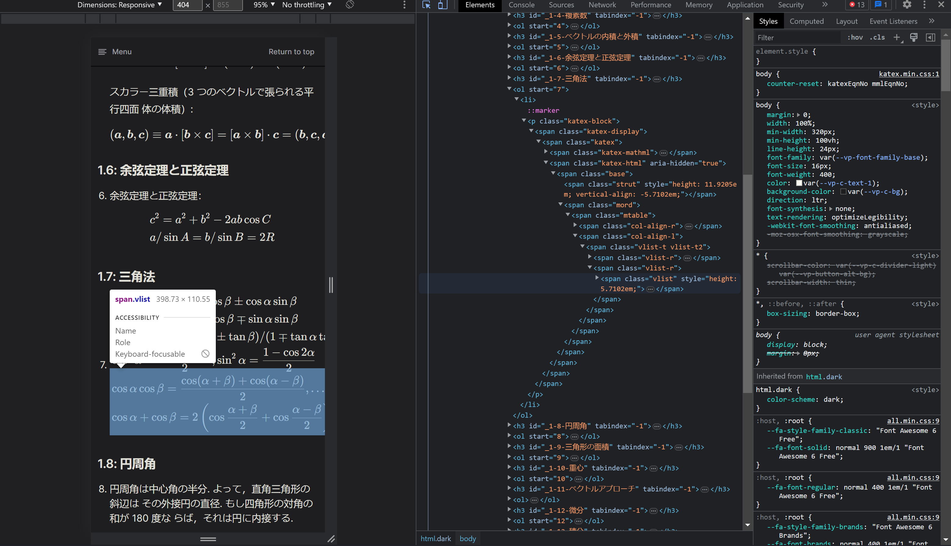
KaTeX works out of the box on large screen devices such as laptops and desktop computers. But as KaTeX's built-in does not support responsiveness on it's default stylings, hence KaTeX equations might overflow out of the default width of the default application containers on small-screened mobile devices as you can see in the following image in the dev tool of chrome, when the dimension of the webpage is set to responsive or under a certain fixed device dimension, the equations rendered in KaTeX overflows out of the viewport as inspected in blue hightlight.

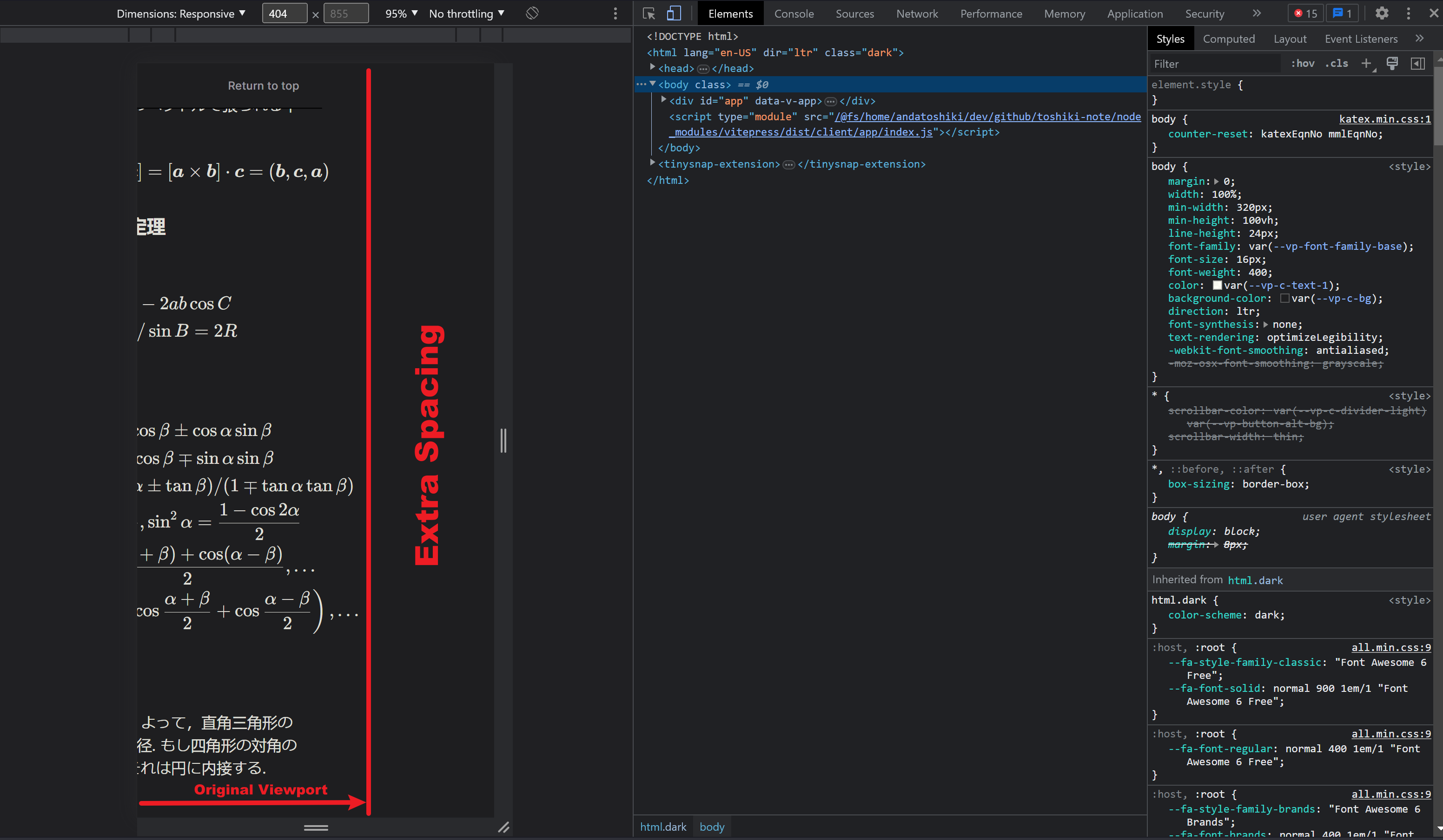
This inevitably causes the viewport to break and extends the default width for KaTeX equations <div> to fit, users will be required to manually scroll right in order to view the full equation consequently as follows,

The above situation is undoubtedly annoying for user experiences while reading documentation, consider at what scenarios users have to scroll, scroll and scroll only for viewing a single long-blocked equation, who would want to read such a text, right? But don't worry we have a simple fix for this situation via by several line of css.
1.2: Temporary solution
If you happened to search over KaTeX's official repo issue tracker on GitHub, there are several user-made css tweaks hack already, the fix is simple by adjusting the overflows of both x and y axes of the KaTeX render <div> blocks. The katex-display > .katex selector targets the child element of the .katex-display class that has the .katex class. This is the element that contains the KaTeX math expression. The first block of styles is mostly concerned with making sure that the KaTeX expression doesn't overflow its container and can be scrolled horizontally if needed. The second block of styles sets the font and line-height for the KaTeX expression and makes sure that its text is properly indented.
But, the issue here is, the overflowing issue is resolved on the webpage, but the style itself left with a slight whitish "box" at the crossing corner of both horizontal as well as vertical scrollbar tracks, this might not be so explicit in the light mode of the webpage, but when it turns to dark mode, the box become annoying. Some people might say it's an easy tweak via setting the display property of the "box" element to display: none; to directly remove the box out of the page, this is a smart approach; however, while the box is gone, the two crossing tracks is going to form an untouched invisible box again against two bars without color. Thus, neither ways seems to perfectly solve the problem.
1.3: Finding solution
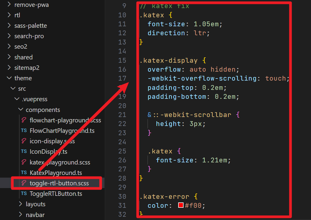
After running a quick research on Google, I found a simple hack tweak used in a theme of VuePress, vuepress-theme-hope on GitHub, the theme both integrate with KaTeX and MathJax for math supports.
Under the styles directory of the repository, several line of scss styles came across my eyes,

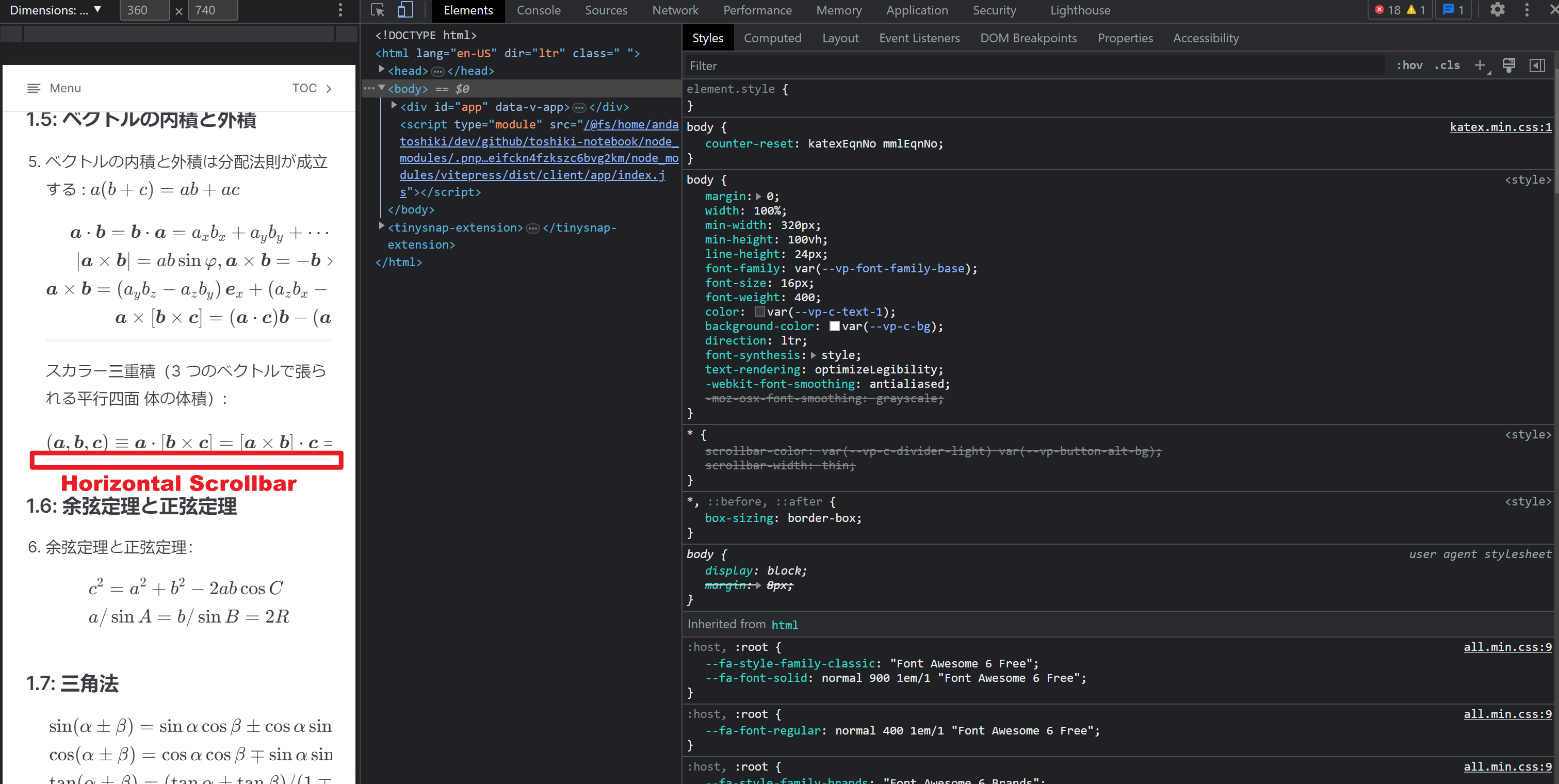
this scss lines only add a horizontal trackbar at the bottom of each overflowing equation while maximizing the vertical height of the equation, when user is on a small screened device as follows,

Consequently, the fix is easy.
1.4: Solution
If you are running a documentation site like this version controlled via Node, especially VitePress without native scss supports, your fix would be installing scss support globally across the project, then add the scss styles and finally import the stylesheets to take effect globally.
Install global scss support using your favored package manager.
sh
$ npm install -D scss$ npm install -D scsssh
$ yarn add --dev scss$ yarn add --dev scsssh
$ pnpm add -D scss$ pnpm add -D scssThen in your scss stylesheets, add the following and link or import them to your global styles, you should be off to go with a complete fix-up for KaTeX.
scss
...

// katex responsiveness fix
.katex {
  font-size: 1.05em;
  direction: ltr;
}

.katex-display {
  overflow: auto hidden;
  -webkit-overflow-scrolling: touch;
  padding-top: 0.2em;
  padding-bottom: 0.2em;

  &::-webkit-scrollbar {
    height: 3px;
  }

  .katex {
    font-size: 1.21em;
  }
}

.katex-error {
  color: #f00;
}
// katex responsiveness fix ends

...
...
// katex responsiveness fix
.katex {
font-size: 1.05em;
direction: ltr;
}
.katex-display {
overflow: auto hidden;
-webkit-overflow-scrolling: touch;
padding-top: 0.2em;
padding-bottom: 0.2em;
&::-webkit-scrollbar {
height: 3px;
}
.katex {
font-size: 1.21em;
}
}
.katex-error {
color: #f00;
}
// katex responsiveness fix ends
...Next, import your styles globally to take effect,
scss
@import '<your-scss-file>.scss';@import '<your-scss-file>.scss';1.4.1: Fix Explanation
The first section sets the base styles for all KaTeX elements by increasing the font size slightly and ensuring that the text direction is left to right.
The second section of code targets the KaTeX display elements specifically. This section adds a bit of padding to the top and bottom of the display elements and sets overflow to auto hidden, which allows the content to scroll inside the container horizontally if it overflows the container's width. The -webkit-overflow-scrolling property is added to ensure smooth scrolling on mobile devices.
Additionally, this section contains a nested .katex selector, which increases the font size of the KaTeX elements within the display element.
The third section targets the .katex-error class and sets the color to red to indicate that there is an error in rendering the LaTeX expression.
1.5: What if I Don't Have SCSS?
If you do not have native scss support for your site, such as a static HTML based documentation site or content management site builder such as Wiki.JS that works as an SaaS which only allows users to apply custom stylesheets within slots provided and make effects, you could use some scss to css converter online with options follows,
to precompile from source scss into normal css styles and use them based on your needs, below are auto-generated compiled css, ONLY take it as reference, I do not guarantee the usability.
css
.katex {
    font-size: 1.05em;
    direction: ltr;
}

.katex-display {
    overflow: auto hidden;
    -webkit-overflow-scrolling: touch;
    padding-top: 0.2em;
    padding-bottom: 0.2em;
}
.katex-display::-webkit-scrollbar {
    height: 3px;
}
.katex-display .katex {
    font-size: 1.21em;
}

.katex-error {
    color: #f00;
}
.katex {
font-size: 1.05em;
direction: ltr;
}
.katex-display {
overflow: auto hidden;
-webkit-overflow-scrolling: touch;
padding-top: 0.2em;
padding-bottom: 0.2em;
}
.katex-display::-webkit-scrollbar {
height: 3px;
}
.katex-display .katex {
font-size: 1.21em;
}
.katex-error {
color: #f00;
}To be continued.
 Toshiki's Note